

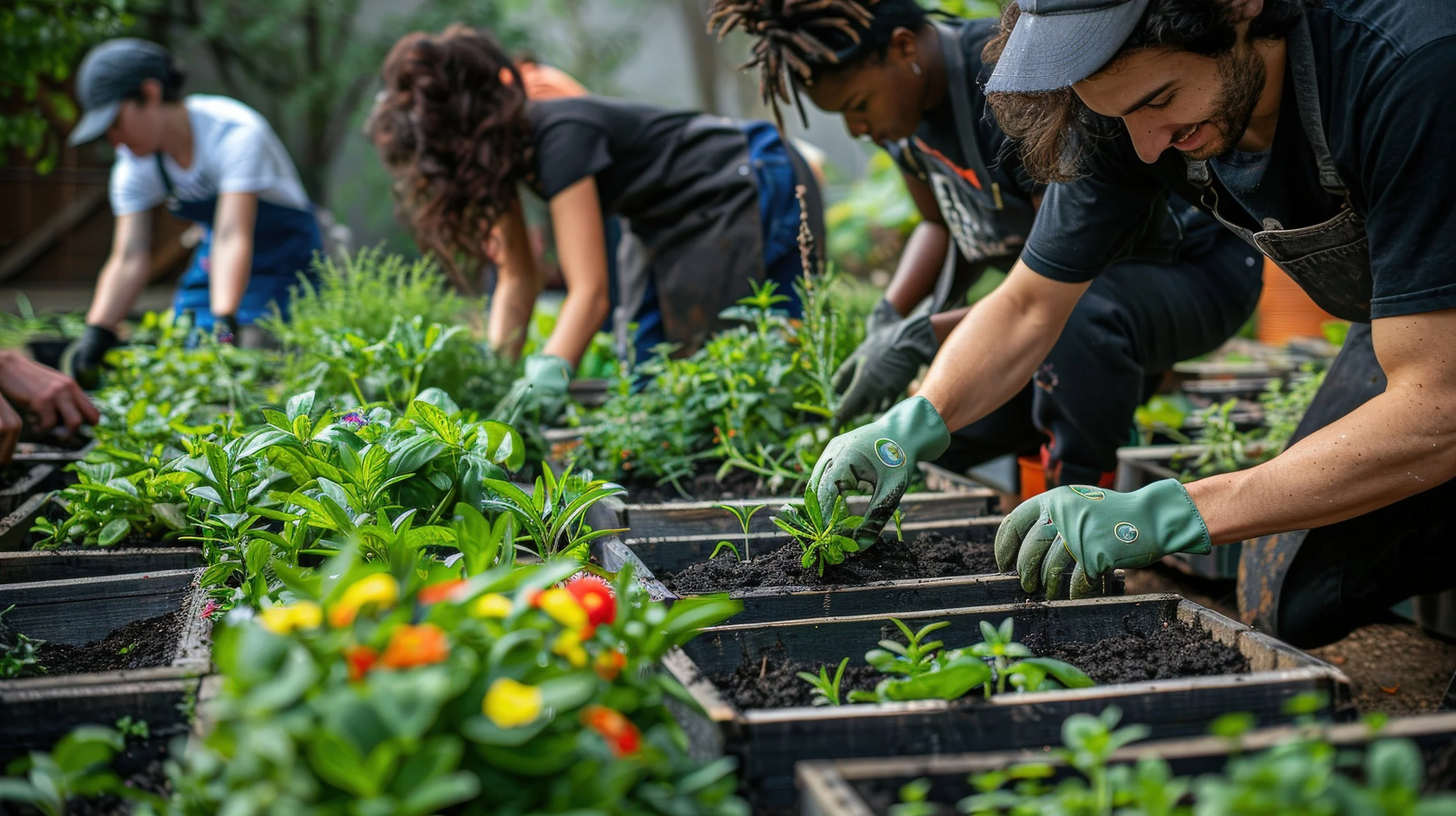

How might we make nutritious food more achievable and inexpensive while simultaneously cultivating a resilient community for marginalized populations in urban locations to practice wellness and improve food justice.
Key Insights
Food justice solutions must integrate access, education, and connection.
Users are motivated by visible progress and shared community impact.
Simple, inclusive design builds trust and long-term engagement.
Competitive Analysis
We analyzed existing food access, community gardening, and sustainability apps to pinpoint strengths and gaps. While many oBered education or food-sharing tools, few combined communication, coordination, and measurable community impact in one platform. This gap shaped our vision for a centralized, community-driven experience.
Local + Global Context
We began by examining local food insecurity in urban neighborhoods and comparing it to global models of community-supported agriculture and digital food-sharing platforms. This helped us identify scalable strategies—like shared gardens and digital food pantries—that could be adapted to local needs.
User Flows
We defined streamlined user flows to ensure intuitive navigation and accessibility. These flows guided users through tasks like reserving produce, posting updates, and viewing personal impact progress—all reinforcing engagement and ease of use. The user flow was updated after iterative and protype processes.
User Research & Personas
We created user personas representing community members, gardeners, and local organizations. These personas reflected diBerent motivations: accessing aBordable produce, sharing knowledge, or organizing resources revealing a shared desire for belonging, simplicity, and visible impact, informing our design priorities
Wireframes & Prototyping
Initial wireframes focused on functionality and hierarchy, later evolving into high-fidelity prototypes with refined visuals and interactions. Feedback from usability testing led to: A community feed to boost engagement, Direct messaging for collaboration, Impact meters to visualize community progress, AI features for learning and problem-solving. Each iteration improved usability and reinforced our goal of a centralized, empowering community platform.
Brand Identity Overview
The Grow On brand identity was designed to feel warm, grounded, and community-centered, reflecting the project’s focus on shared care, food access, and sustainability. The visual system balances approachability with structure to ensure the platform feels welcoming to users of all backgrounds and experience levels. The Grow On visual system uses a nature-inspired color palette and simple iconography to create a warm, accessible experience. Deep greens ground the brand in sustainability and trust, while a bright yellow-green adds energy and optimism. Supporting accent colors drawn from produce, soil, and sky bring balance and flexibility across the interface. Clean typography and a clear hierarchy ensure readability, while rounded, minimal icons mirror the softness of the logo—making the UI feel intuitive, inclusive, and community-focused.
Logo System
The Grow On logo features rounded letterforms and an integrated sprouting leaf within the “g,” symbolizing growth, nourishment, and collective responsibility. The mark communicates life and progress while remaining simple and flexible. A horizontal logo, vertical logo, and standalone logomark ensure consistency and scalability across digital interfaces and physical applications.