Rural Reproductive Justice Alliance
Brief
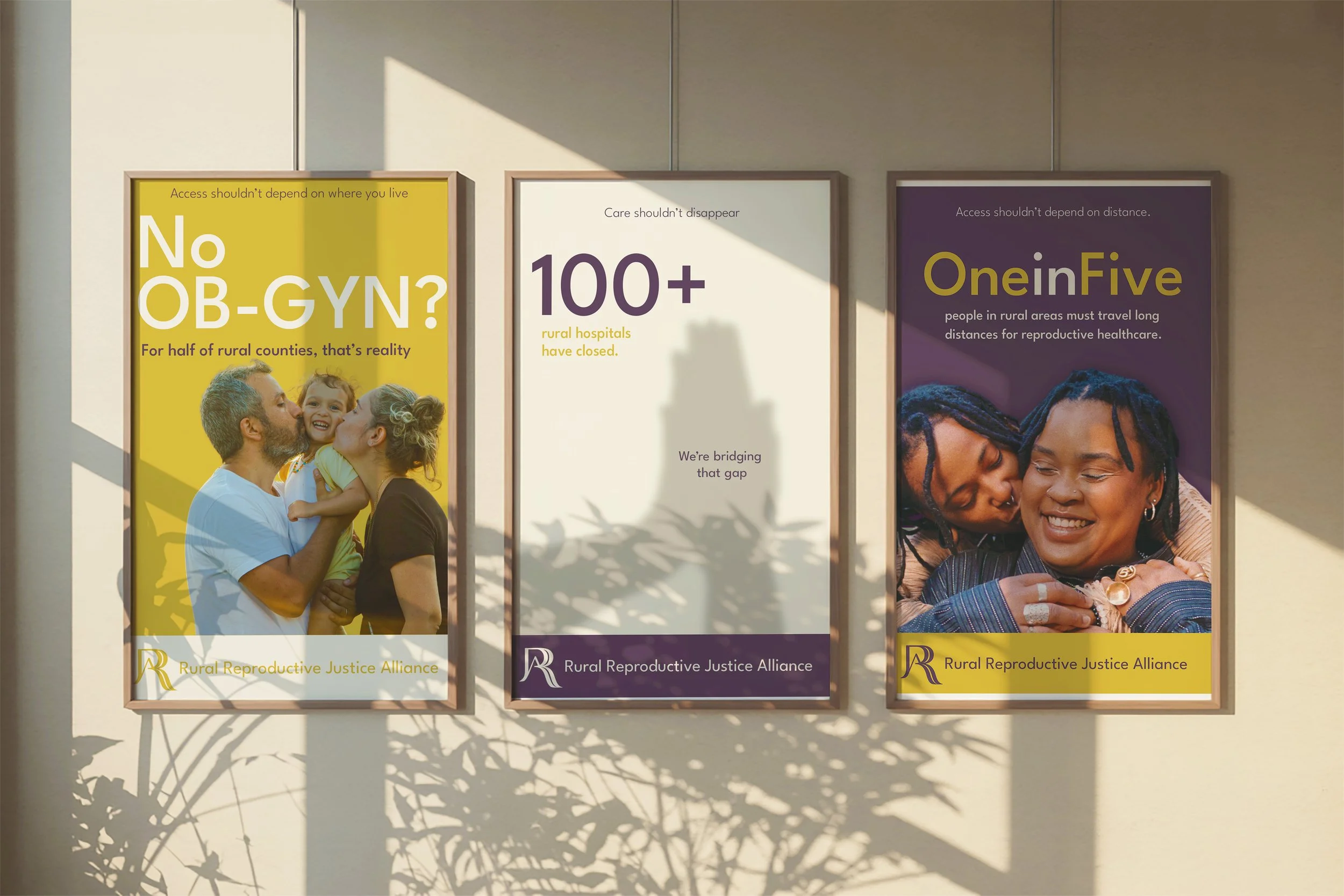
Rural Reproductive Justice Alliance is a nonprofit supporting reproductive freedom and access in rural communities. They needed a visual identity that felt trustworthy, community-centered, and inclusive, while communicating the seriousness of their mission.
Solution
I developed a flexible identity built around a monogram logo, warm earth-tone palette, and a visual language inspired by their core values (autonomy, justice, equity, community, advocacy and empowerment).
The system includes typography, color standards, and usage guidelines to help RRJA maintain a consistent and approachable presence. The final brand reflects their mission: supportive, rooted, and accessible—something their community can immediately recognize and trust.
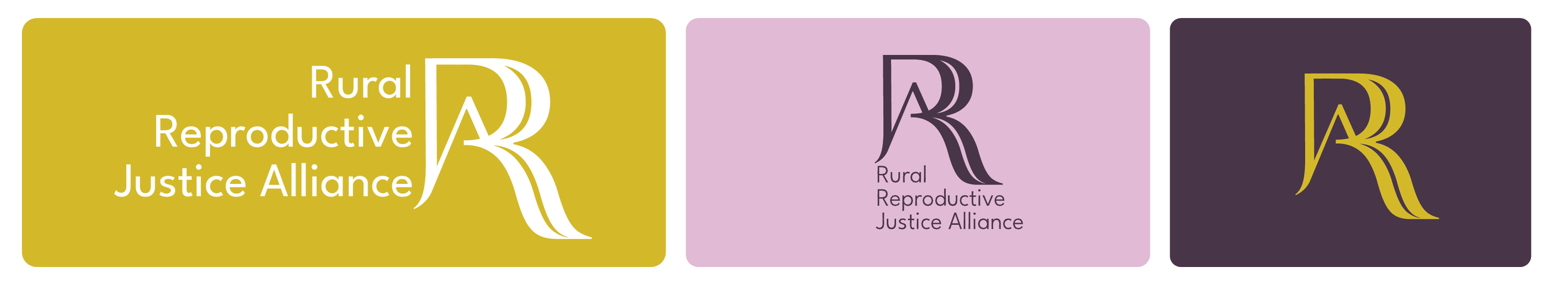
Logo
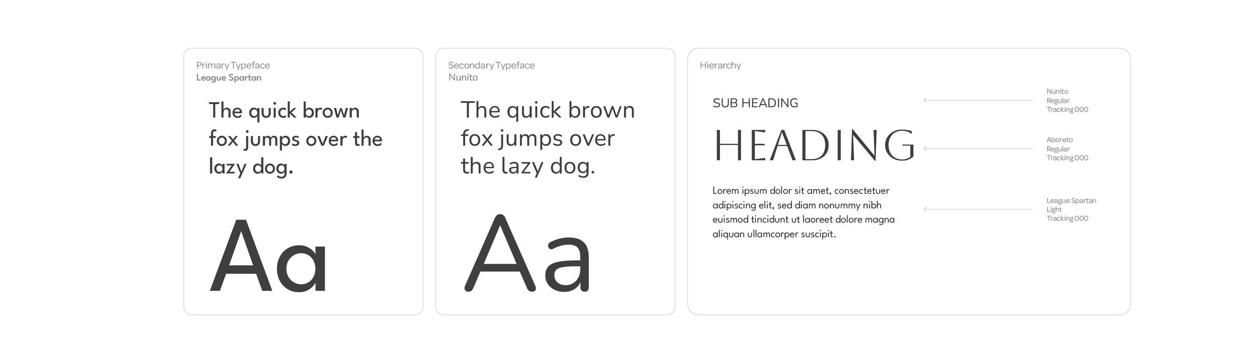
Typography
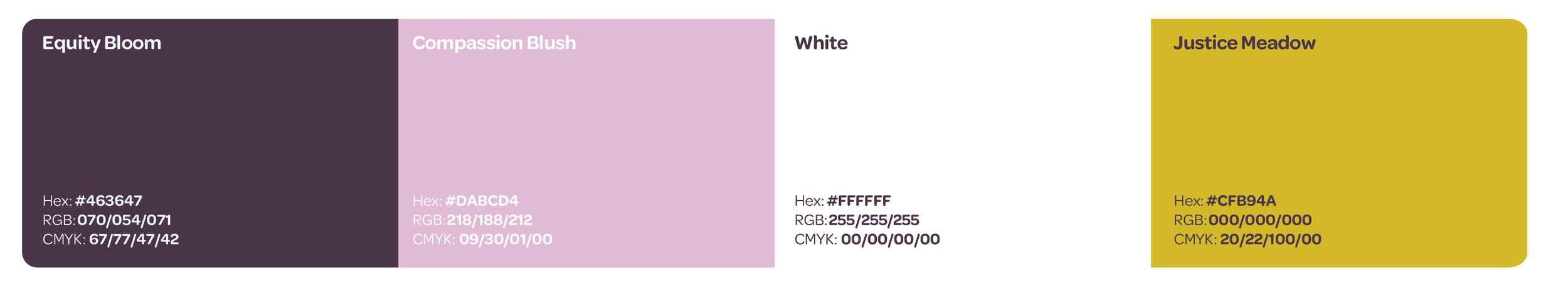
Color Pallete
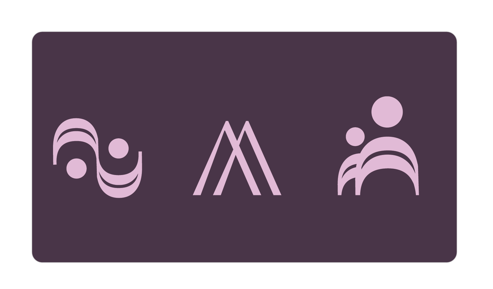
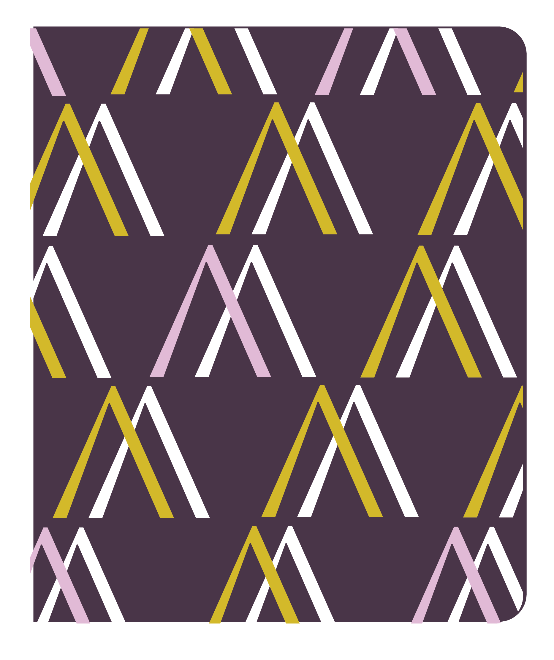
Iconography
Each icon reflects RRJA’s core values in a simple, The icon system uses three simple forms, each designed to represent more than one of their core values:
Connected Circles
Symbolizes community and empathy through shared shapes and balanced relationships.
Upward Mountains
Communicates equity and justice.
Supporting Figures Overlapping human forms represent community through connection, and advocacy by standing together and supporting one another.
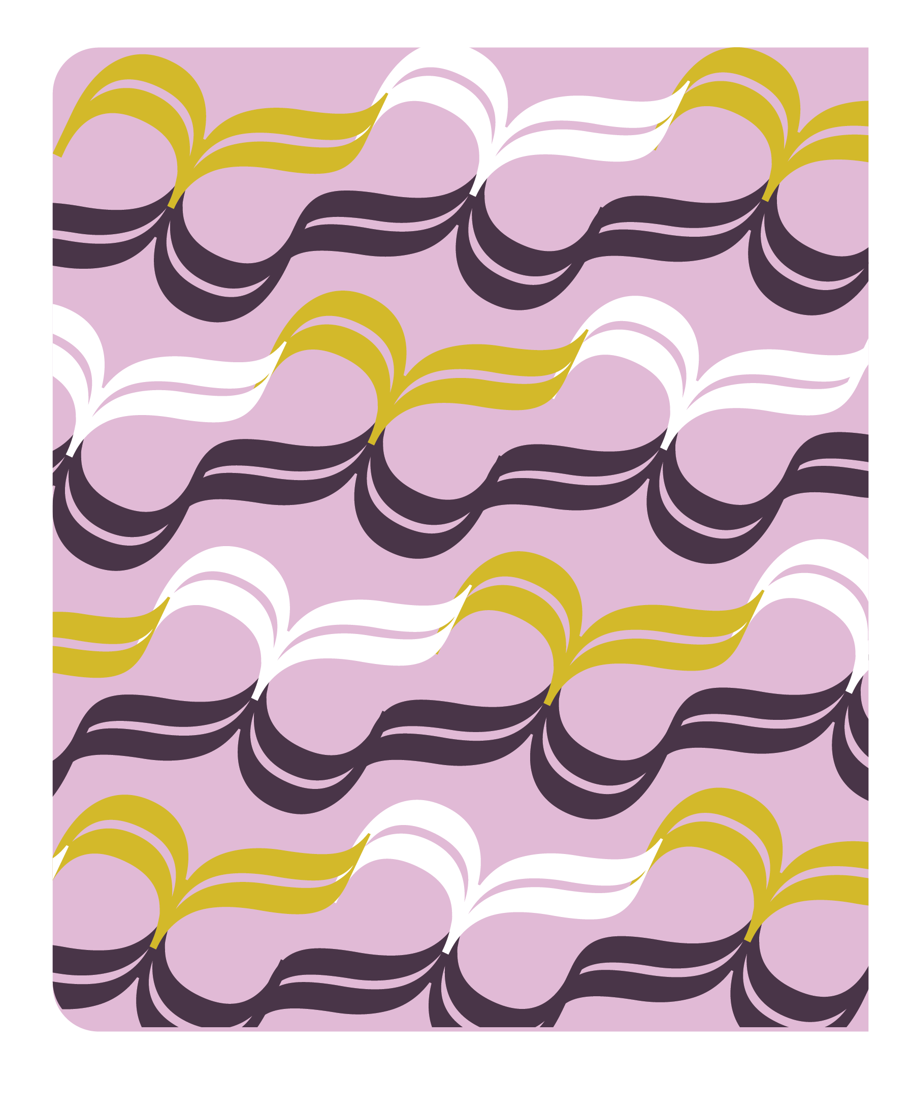
Pattern